Challenge #2

The Checkout of Doom 😱

61

Challenge Summary

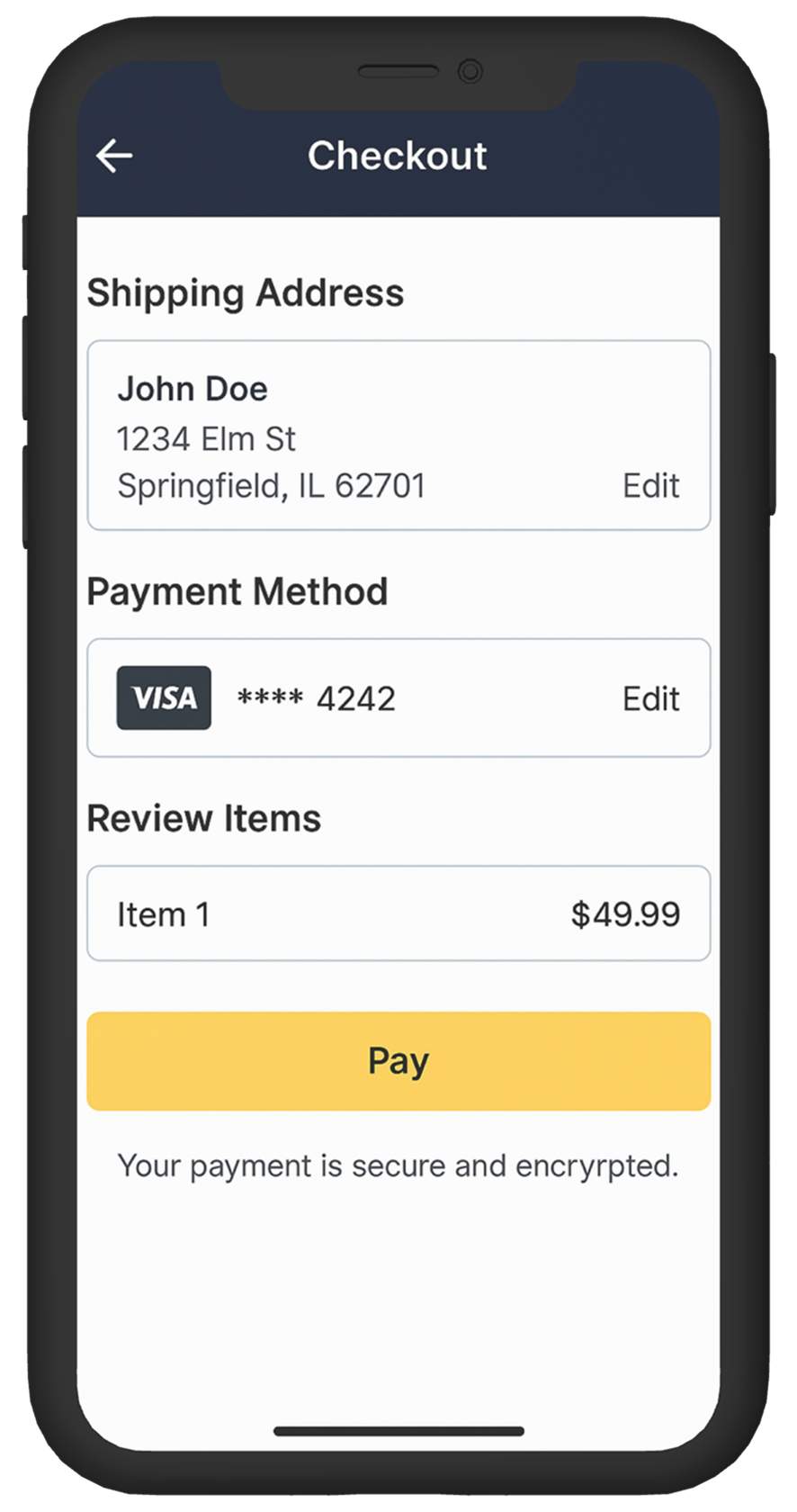
The current checkout page is scaring users away.
Despite having items in their cart, many users abandon their purchase once they land on this screen. Users complain that it’s confusing and slow, and the company wants to improve conversion without overhauling the backend logic.

Tags :

Navigation Issue
Overloaded UI
Trust Issues
Conversion Drop
Mobile UX

Platform :

Mobile

Estimated Time :

45 Minutes

Hear The People

Insights from users, clients, and stakeholders that shaped the experience.

The User says

Users felt confused and unsure whether their payment went through. There was no feedback or confirmation after submitting, making it feel like the page was broken.

The Client says

The client is concerned about how outdated the checkout looks and believes it’s damaging user trust. Their main goal is to make the experience feel safer and more reliable.

Company Constraints

The redesign must stick to the brand's existing color palette (dark blue and yellow), use Roboto as the only font, and avoid any custom icons or illustrations due to budget limits.

Target User Persona

Defining the real people behind the screens.

Ahmed, 29, Cairo

  • Buys tech gadgets from mobile while commuting

  • Low attention span, gets easily distracted by slow or unclear interfaces

  • Prioritizes trust and speed over visual design

  • Often uses low-end devices and 4G internet

Heat Map

c#2

Brand Colors

A curated palette aligned with the brand’s identity, tone, and accessibility needs.

rgb(0,31,63)
rgb(255,220,0)
rgb(170,170,170)
rgb(51,51,51)

User Reviews

Real feedback from users — highlighting wins, pain points, and opportunities.

User 1

Feels like 2010 checkout. So cluttered.

User 2

No back button, got stuck.

User 3

It works, but man it’s ugly.
Learning Objectives
  • Learn how to balance business constraints with UX improvements

  • Practice designing for low-trust, high-stakes screens

  • Improve decision-making with limited UI assets

  • Create a flow that works even under low connection speeds

Join to Hundreds of Designers

Submit your answer on Linked In using hashtag #uxforces