Challenge Summary
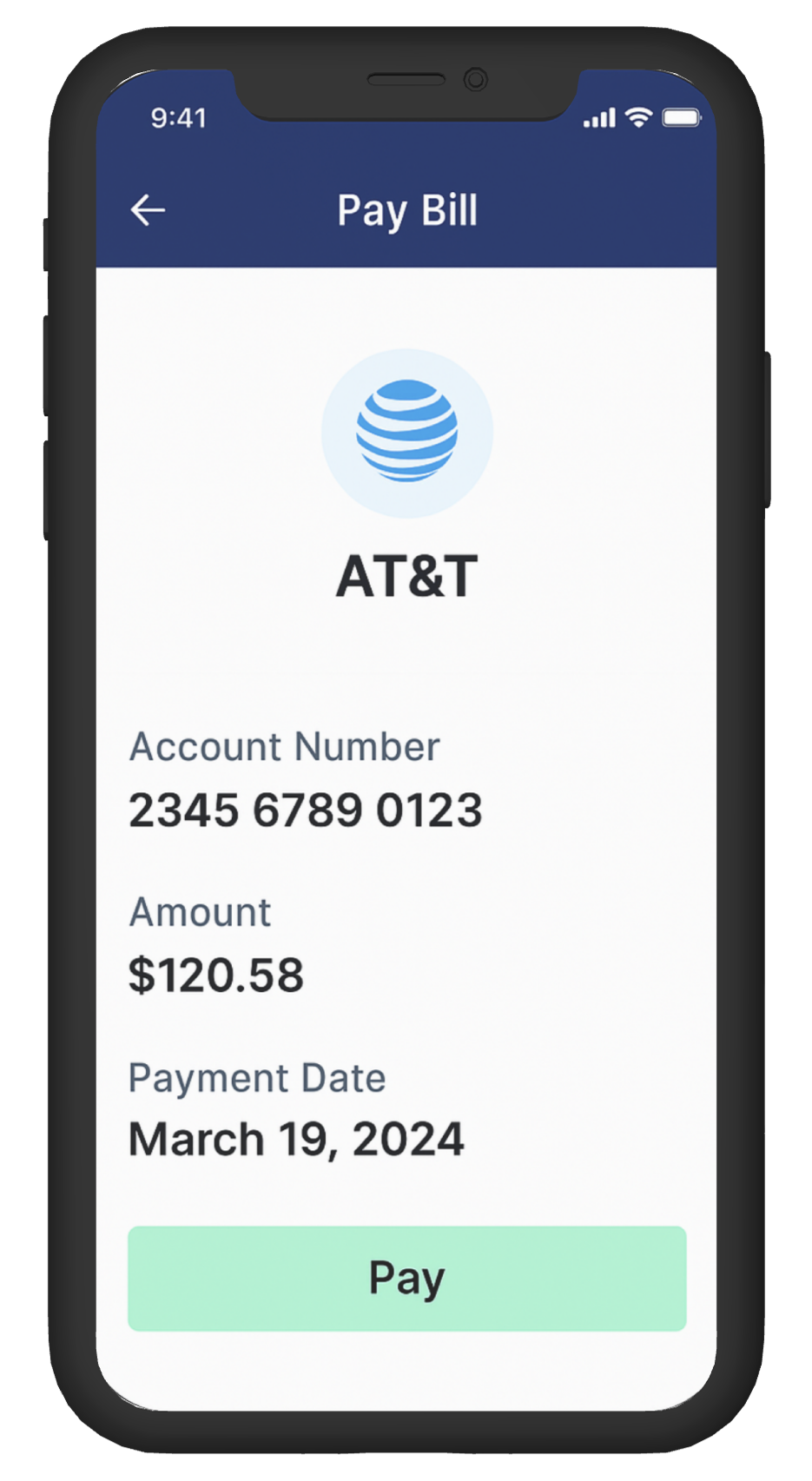
The bill payment screen in a finance app leaves users uncertain if their payment was processed successfully.
There’s no clear confirmation, no receipt, and no feedback animations. The layout feels static, and the payment button sometimes reloads the screen without indication. Users often retry — risking double charges or unnecessary stress.
Estimated Time :
45 Minutes
Hear The People
Insights from users, clients, and stakeholders that shaped the experience.
Target User Persona
Defining the real people behind the screens.
Hassan, 40, Cairo
-
Pays utility and internet bills through the app
-
Often multitasks while paying (work or kids around)
-
Gets anxious with unclear confirmations
-
Wants fast but trustworthy feedback
Brand Colors
A curated palette aligned with the brand’s identity, tone, and accessibility needs.
User Reviews
Real feedback from users — highlighting wins, pain points, and opportunities.