Challenge #8

Booked or Broken? 🩺📅

37

Challenge Summary

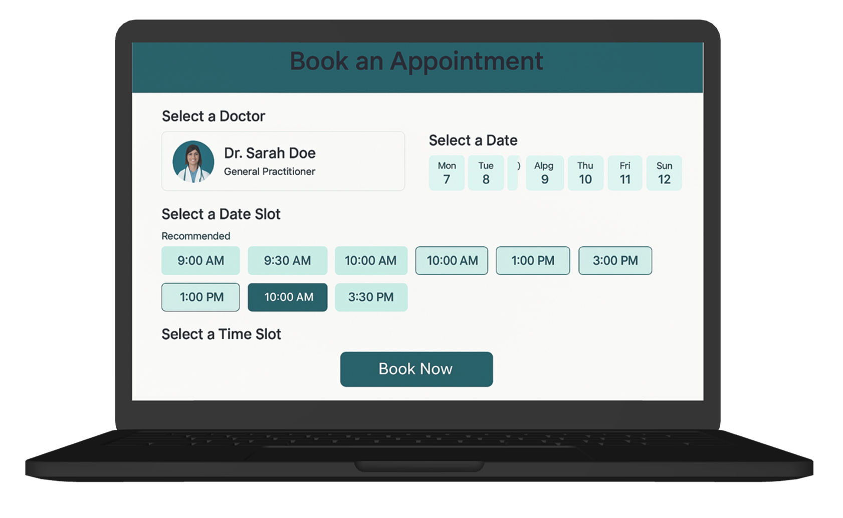
The telehealth appointment booking screen feels chaotic and unclear.
Patients are unsure which doctors are available, what time slots mean, or whether they’ve even booked successfully. There’s inconsistency in time zone info, button states, and feedback. Users abandon the flow or call customer support to confirm bookings.

Tags :

Booking UX
Accessibility
Calendar Clarity
Visual Feedback
Healthtech

Platform :

Web

Estimated Time :

50 Minutes

Hear The People

Insights from users, clients, and stakeholders that shaped the experience.

The User says

I chose a doctor and picked a time, but after clicking “Book Now,” nothing changed. Did I book it? Can I reschedule? No email, no receipt, no confirmation.

The Client says

We wanted to make the booking flow simple and frictionless, but we’re getting flooded with customer service tickets about booking status and wrong time slots. We want it to feel clean, clear, and fail-safe.

Company Constraints

You can’t redesign the entire flow (multi-step structure must stay) Time slot data must come from the current backend format Must be usable on low-contrast screens (older patients, older devices)

Target User Persona

Defining the real people behind the screens.

Amina, 55, Alexandria

  • Books doctor appointments for her and her parents

  • Uses a tablet and occasionally an old laptop

  • Gets nervous if she doesn’t get instant confirmation

  • Needs easy-to-read layout, clear buttons, and visual success indicators

Heat Map

c#8

Brand Colors

A curated palette aligned with the brand’s identity, tone, and accessibility needs.

rgb(0,95,115)
rgb(10,147,150)
rgb(148,210,189)
rgb(0,18,25)

User Reviews

Real feedback from users — highlighting wins, pain points, and opportunities.

User 1

I clicked Book Now and nothing happened. Did it work?

User 2

Time slots are confusing — what time zone is this?

User 3

Great concept, but I need clearer confirmation.
Learning Objectives
  • Design intuitive appointment flows that instill trust and reduce anxiety

  • Improve clarity through visual states, confirmations, and accessibility

  • Balance simplicity with detailed context (like time zones or provider details)

  • Use contrast, labels, and hierarchy for inclusive healthcare UX

Join to Hundreds of Designers

Submit your answer on Linked In using hashtag #uxforces