Challenge Summary
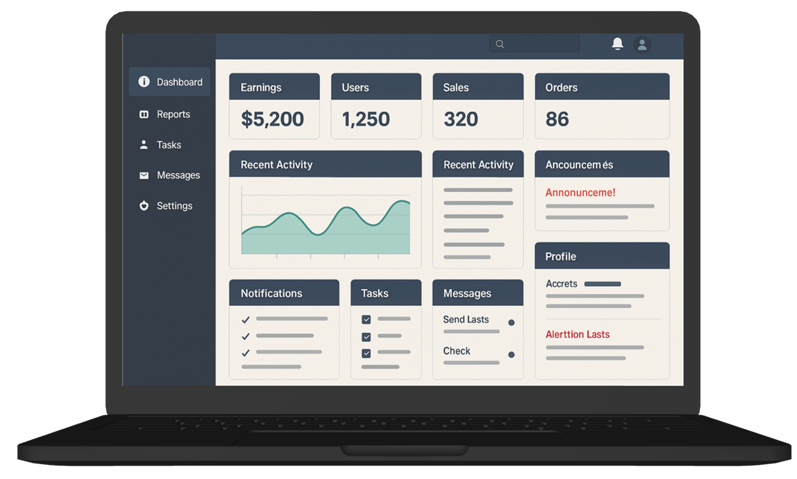
The homepage dashboard tries to show everything… and ends up showing nothing.
Users land on a page crammed with widgets, stats, charts, alerts, and quick actions. While all the data is technically useful, there’s no clear entry point, no flow, and no sense of priority. Users feel overwhelmed and often ignore most of it — or bounce completely.
Estimated Time :
60 Minutes
Hear The People
Insights from users, clients, and stakeholders that shaped the experience.
Target User Persona
Defining the real people behind the screens.
Mona, 31, Giza
-
Operations manager who checks the dashboard every morning
-
Wants a quick sense of what needs attention
-
Often in a rush and multi-tasking
-
Prefers summaries with drill-down options rather than raw data
Brand Colors
A curated palette aligned with the brand’s identity, tone, and accessibility needs.
User Reviews
Real feedback from users — highlighting wins, pain points, and opportunities.