Challenge Summary
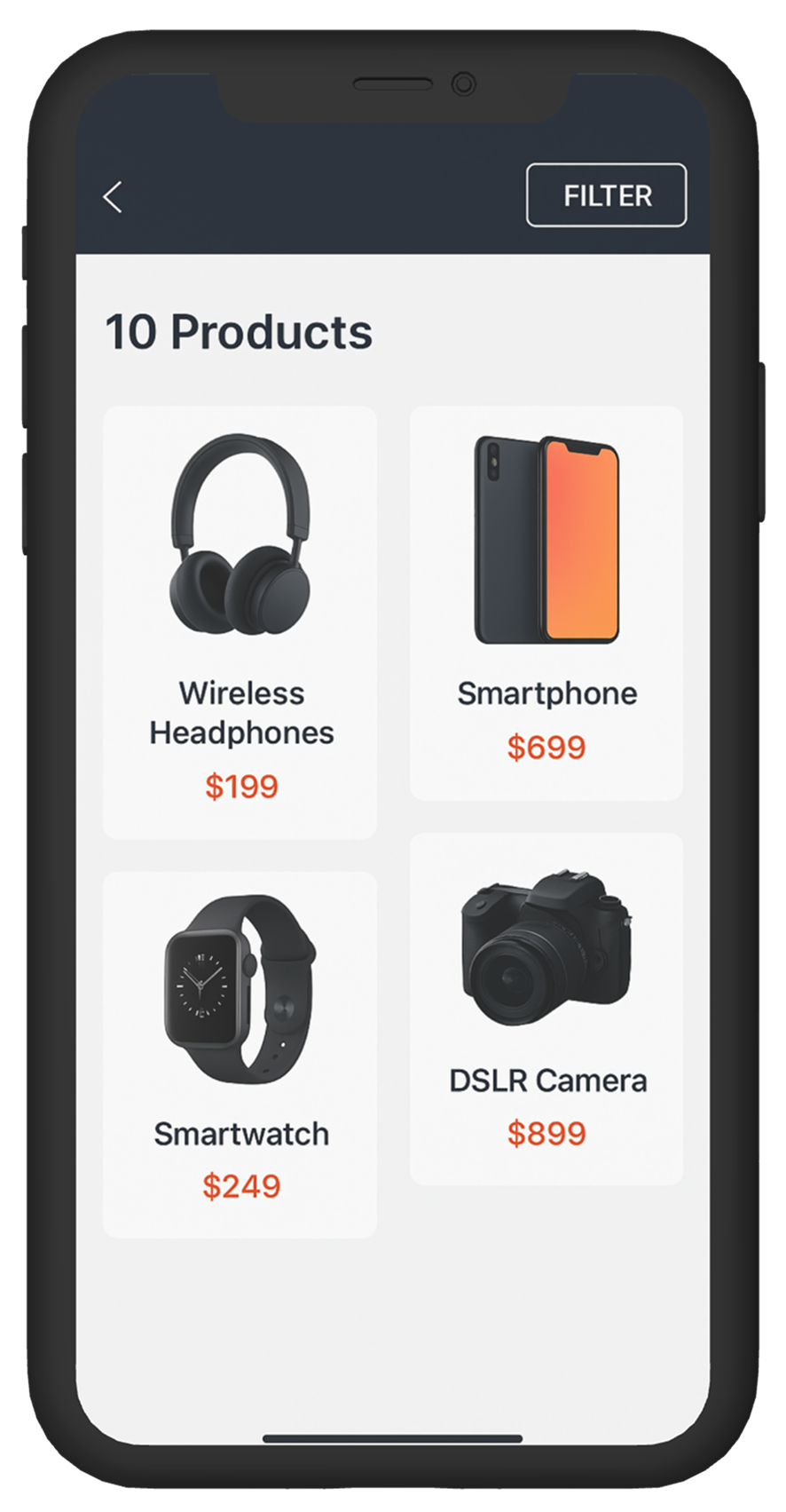
The product listing page looks clean, but filtering is painful.
The site has dozens of filters on mobile, but they’re hidden behind a small icon and lack clarity once opened. Users can’t see what filters are active, the UI resets unexpectedly, and scrolling through categories is frustrating. It’s making exploration feel like a chore.
Estimated Time :
45 Minutes
Hear The People
Insights from users, clients, and stakeholders that shaped the experience.
Target User Persona
Defining the real people behind the screens.
Rana, 33, Riyadh
-
Shops frequently from mobile while commuting
-
Likes to browse and compare across categories
-
Gets frustrated by laggy or clunky filter UIs
-
Prefers persistent filters with clear visibility of what’s selected
Brand Colors
A curated palette aligned with the brand’s identity, tone, and accessibility needs.
User Reviews
Real feedback from users — highlighting wins, pain points, and opportunities.